Enhancing the At-Home Entertainment Experience with the FandangoNOW Mobile App

Fandangonow mobile redesign
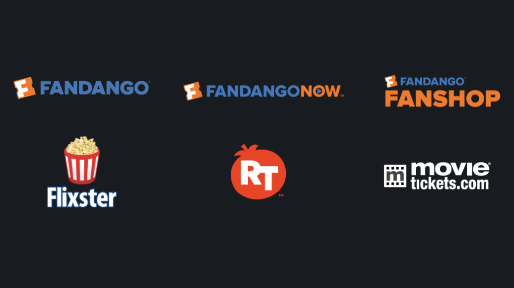
In 2018, FandangoNOW, a subsidiary entertainment company owned by NBC Universal, made it easy for movie fans to rent or buy movies directly on their mobile devices or smart TVs. Previously known as M-GO, the platform was rebranded after Fandango acquired it. Our team took on the challenge of redesigning the app to align visually with the Fandango ecosystem, aiming to create a more integrated and user-friendly experience.
My role was to lead redesign efforts on our mobile Android application.
ROLE
Lead UI Designer
RESPONSIBILITIES
Prototyping
Design system management
Interaction design
Context
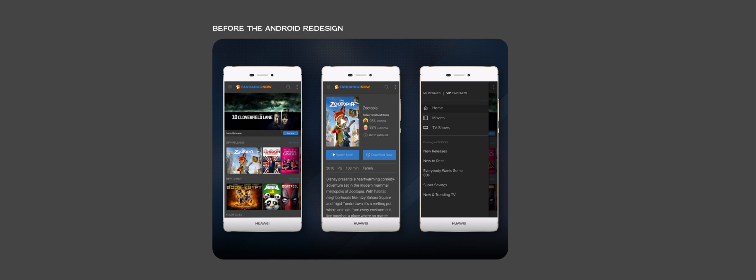
After M-GO was acquired by Fandango, our Android mobile app needed a complete overhaul so it could look cohesive across the Fandango suite of products.
CHALLENGEs
During 2017-2018, it seemed like Fandango acquired a new company every few months. It became important for our team to establish some sense of consistency across our products to establish trust with old and new audiences.
concept development
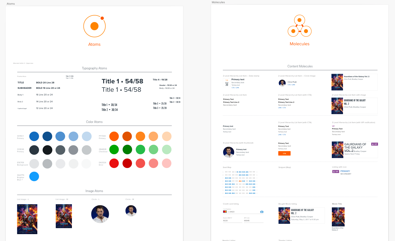
My self and another member of our team worked with our lead designer to create an atomic design system of components. The goal was for each designer to use the new system across TV, web and mobile products. To begin this work, each of us did an audit on areas to align. We found that to maintain consistency, we would need to establish rules around movie posters, type, profile images and branded colors.
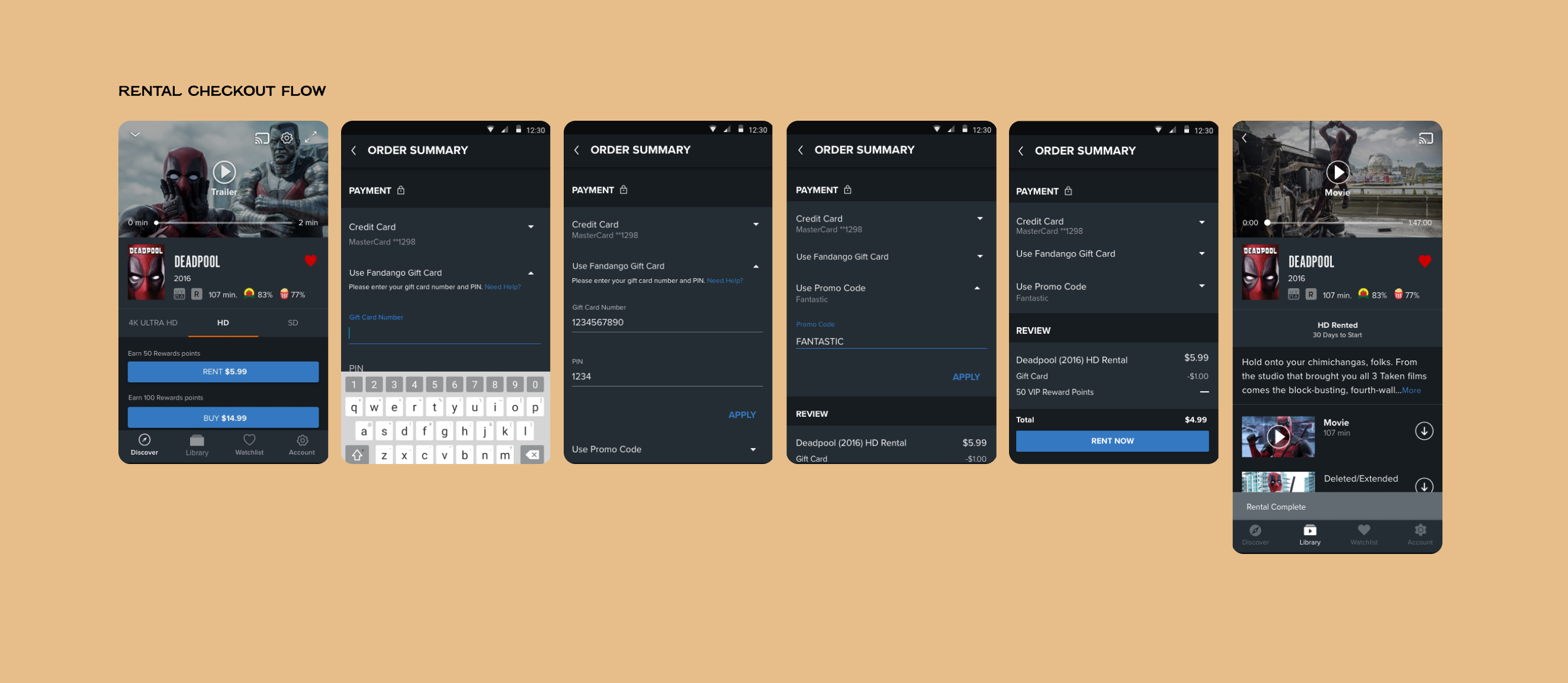
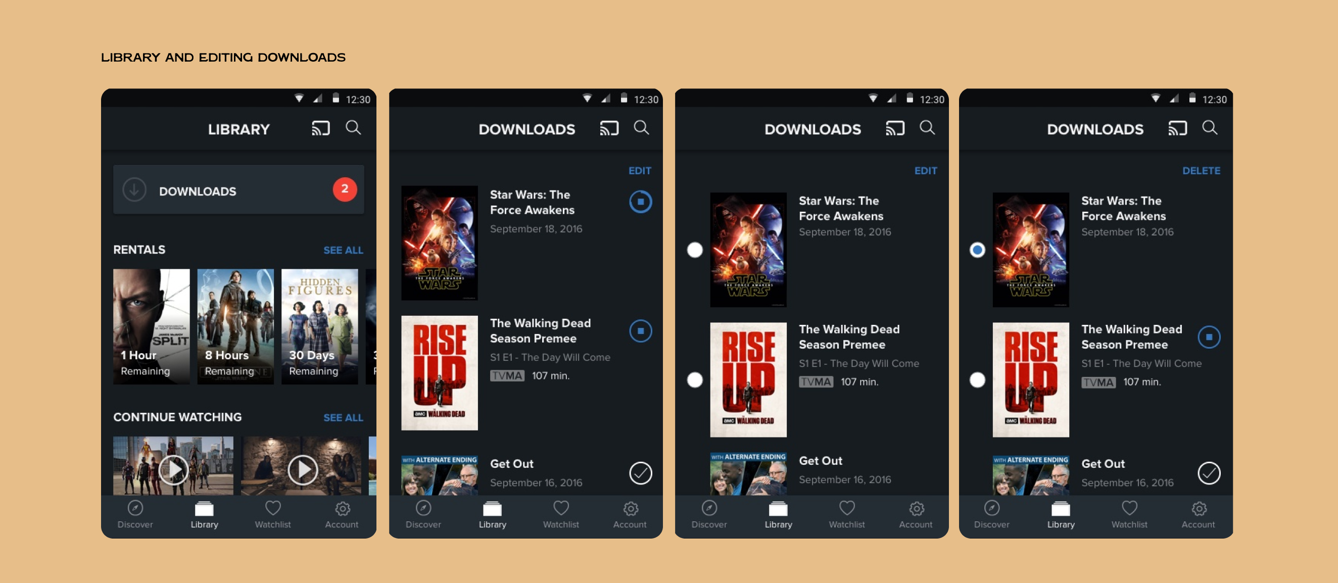
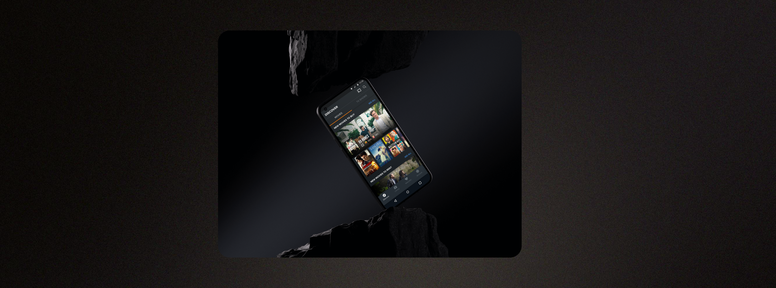
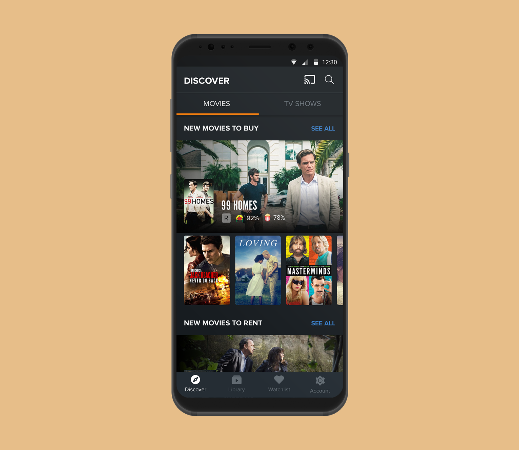
The android redesign
After our team developed a cohesive set of redesigned atomic design system components, I applied our new color scheme and typography to revamp the entire Android app. This reskinning included implementing standardized Material design patterns to enhance usability. We introduced cards to suggest tactility, added feedback for tapped elements, and effectively used primary and secondary colors to differentiate between screen elements. This approach not only refreshed the app’s look but also improved its navigational flow.
OUTCOME
After collaborating with researchers who conducted several rounds of user testing, we launched the redesigned app in April 2018. It was a significant achievement for our team, and I was thrilled to see the positive reception from users. At the time of my departure, the app had earned a rating of 3.6 out of 5 stars in the Google Play store, with 8,504 reviews, reflecting our commitment to improving user experience.