LEAD DESIGN ON MOBILE REDESIGN
In 2018 FandangoNOW was an application that allowed movie lovers to rent or buy movies directly from their mobile device or smart TV. Previously known as M-GO, after the acquisition from Fandango, our team focused on a visual redesign of our applications that could fit into the Fandango ecosystem.
GOAL
The goal was to create a cohesive experience that would allow Fandango customers to have a seemless experience across Fandango products.
Role: My role as a UI and interaction Designer on the team was to lead efforts around the visual redesign of our FandangoNOW Android app.
I worked with a Lead Architect who focused on user flows. During this project I also lead efforts around designing components for our Atomic design system .
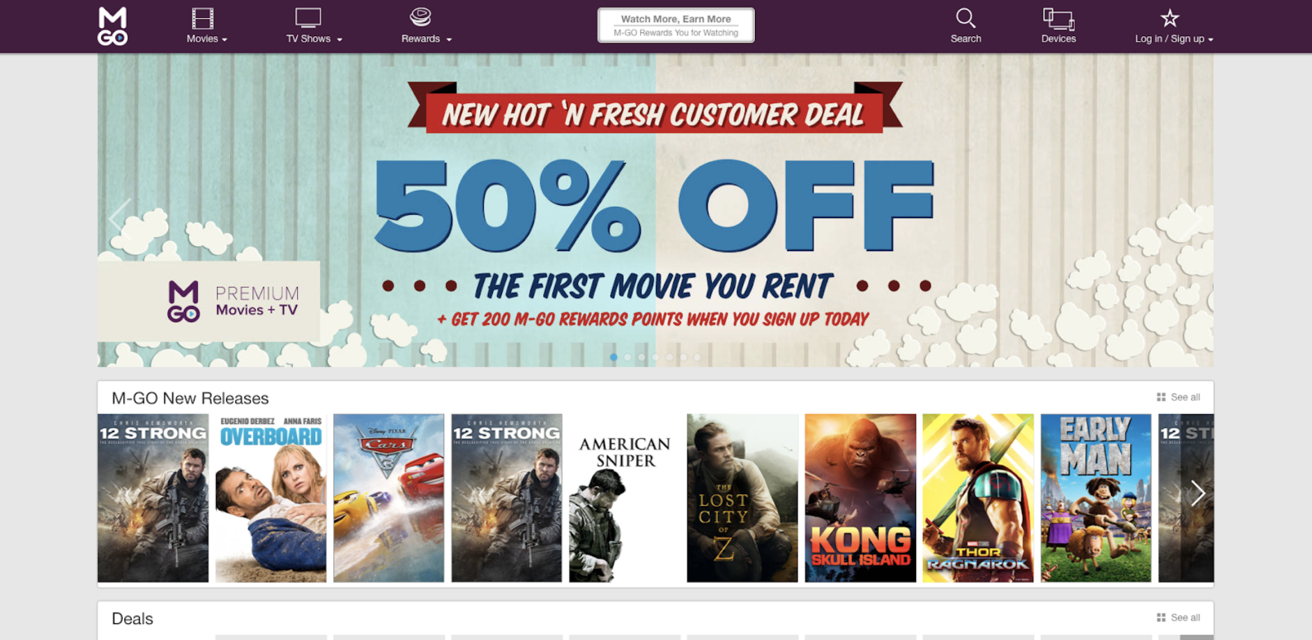
BEFORE THE REDESIGN, WE HAD WEB 2.0
For a brief history of the evoluton of how our design system evolved, this is how the M-GO website looked in early 2016.
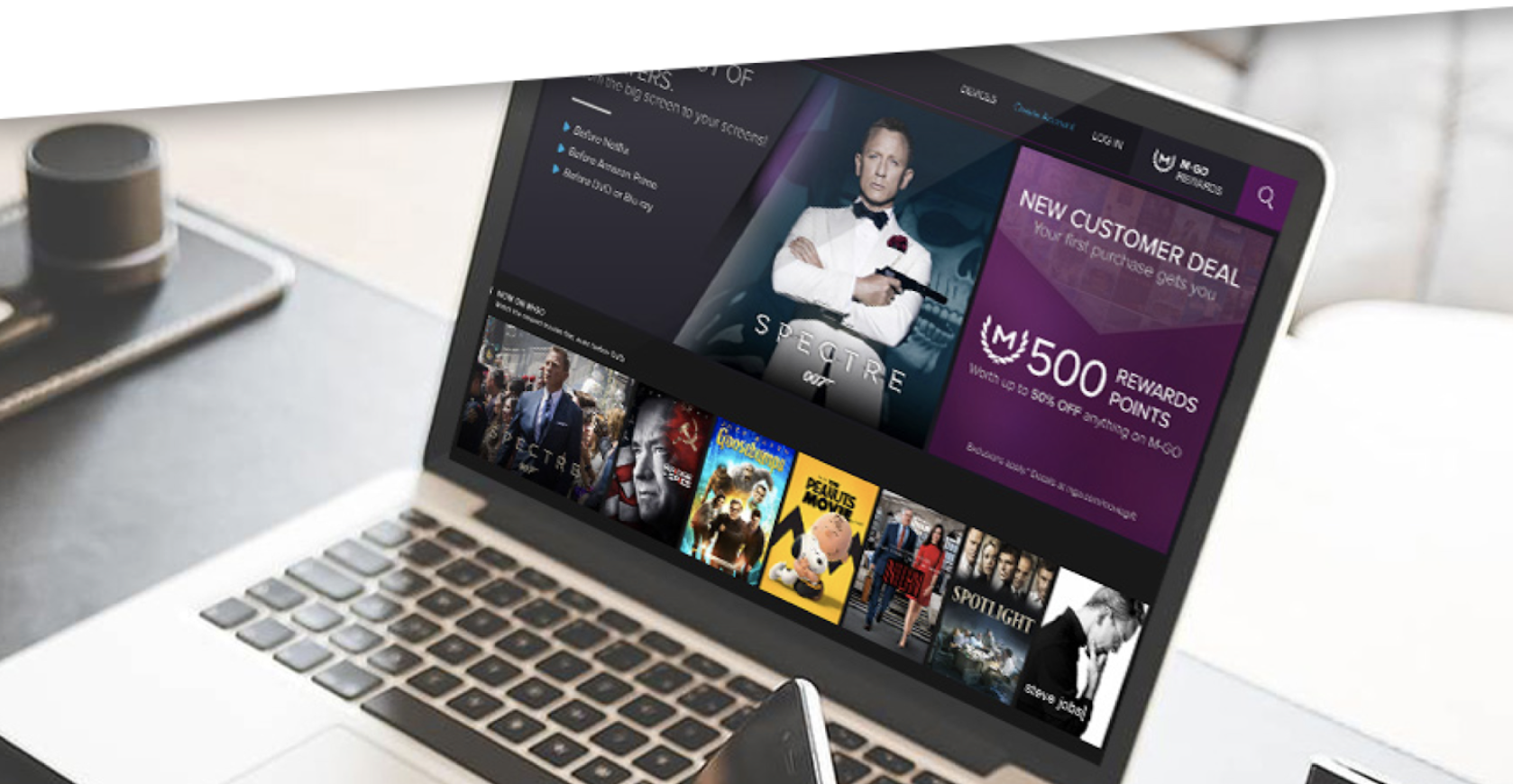
THEN WE WENT FOR A MODERN LOOK & FEEL
By mid 2016, we worked on Web 3.0. Obviouslly, we were trying to find our identity and it was an adventure creating a design system from scratch.
Our mobile designs would follow patterns based on what we used on for our desktop apps.
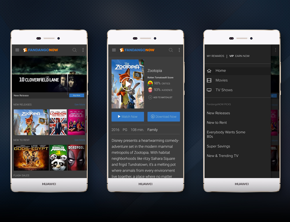
BEFORE THE MOBILE REDESIGN
After M-GO was acquired by Fandango, our Android mobile app needed a complete overhaul so it could look cohesive across the Fandango suite of products.
To the right, you could see how our product's look and feel was out of place with Fandango's brand.
A GROWING SUITE OF PRODUCTS. LOTS OF INCONSISTENCY.
During 2017-2018, it seemed like Fandango acquired a new company every few months.
It became important for our team to establish some sense of consistency across our products so our customers would not get confused with each touch point.
A GROWING DESIGN TEAM
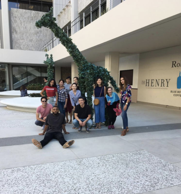
Within a year, we doubled in size from a team of 4 product designers to 8 people. Design was becoming more valued at Fandango and we wanted to tell a cohesive narrative while working together.
THE TEAM APPROACH
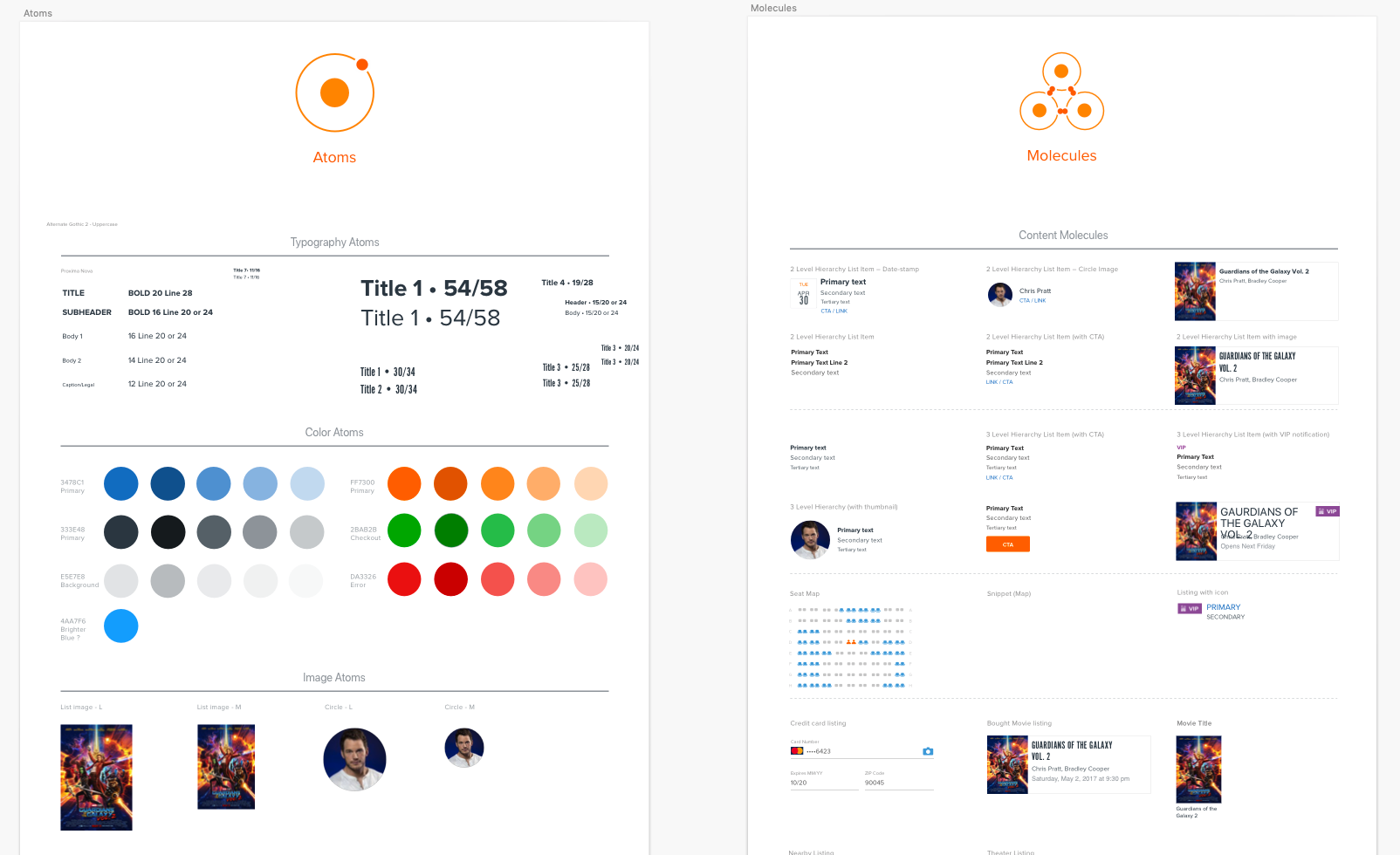
One of our design leads created an atomic design system of components for each squad to use. Between Fandango and FandangoNOW, an audit was done around areas of alignement. The below items are where there was crossover between the two products:
- Movie posters
- Typography
- Profile images
- Branded colors
ANDROID APP REDESIGN
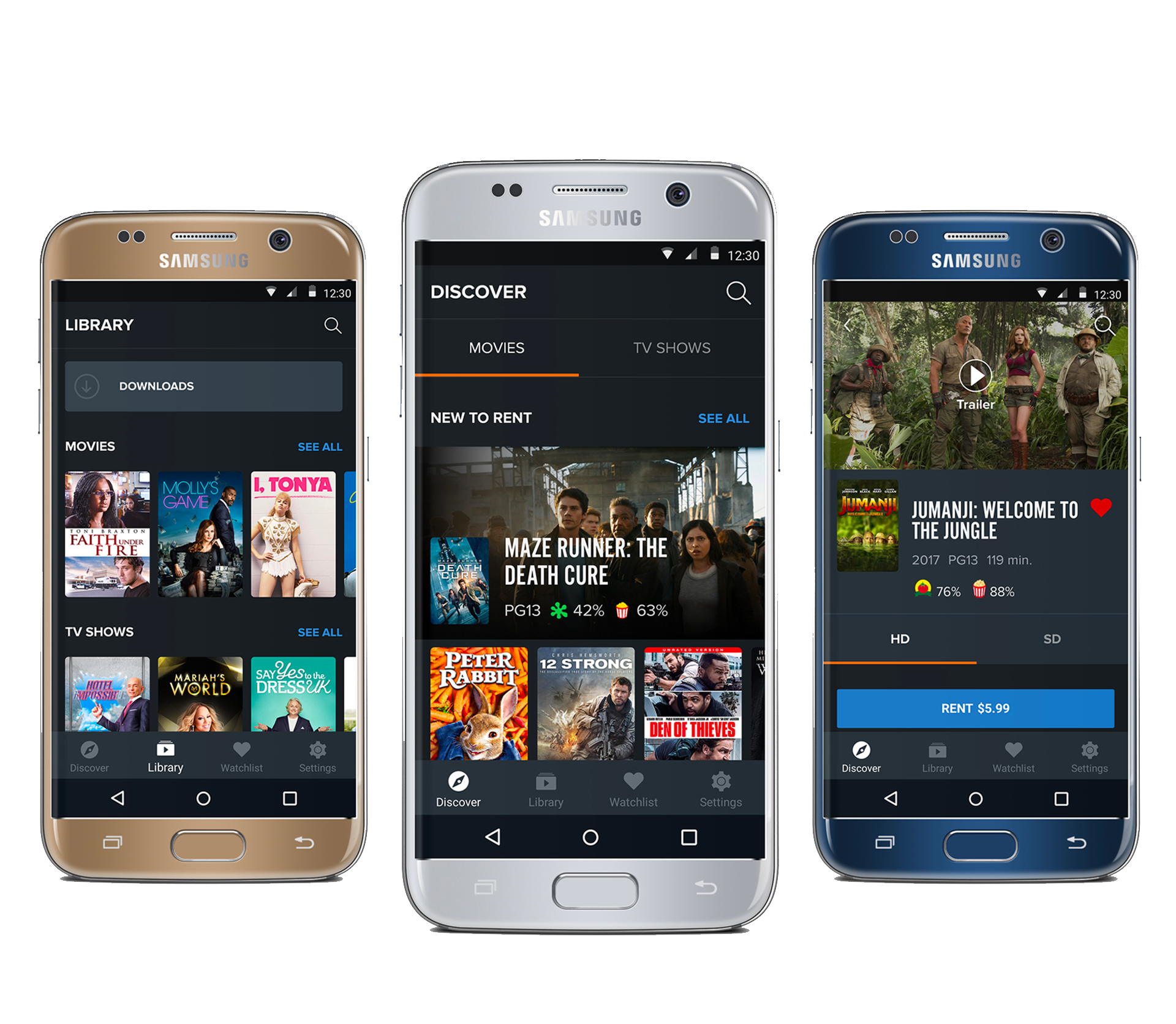
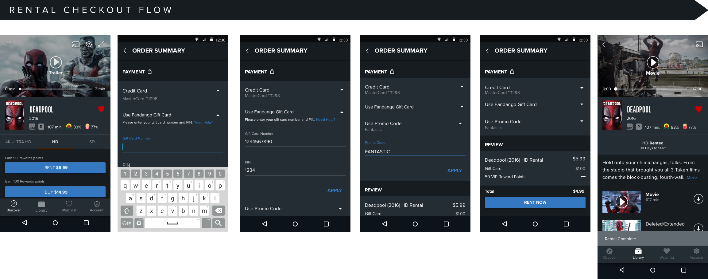
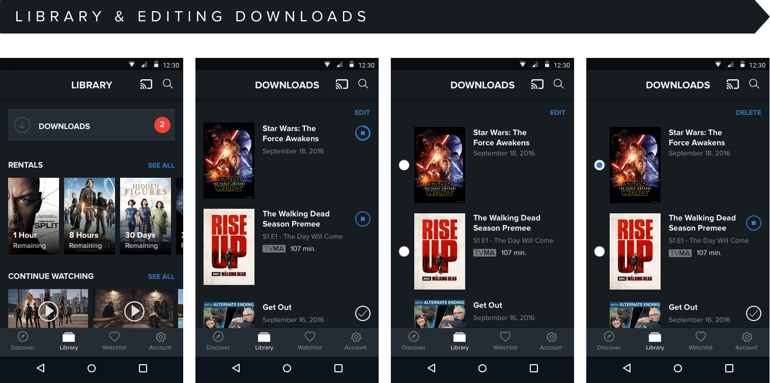
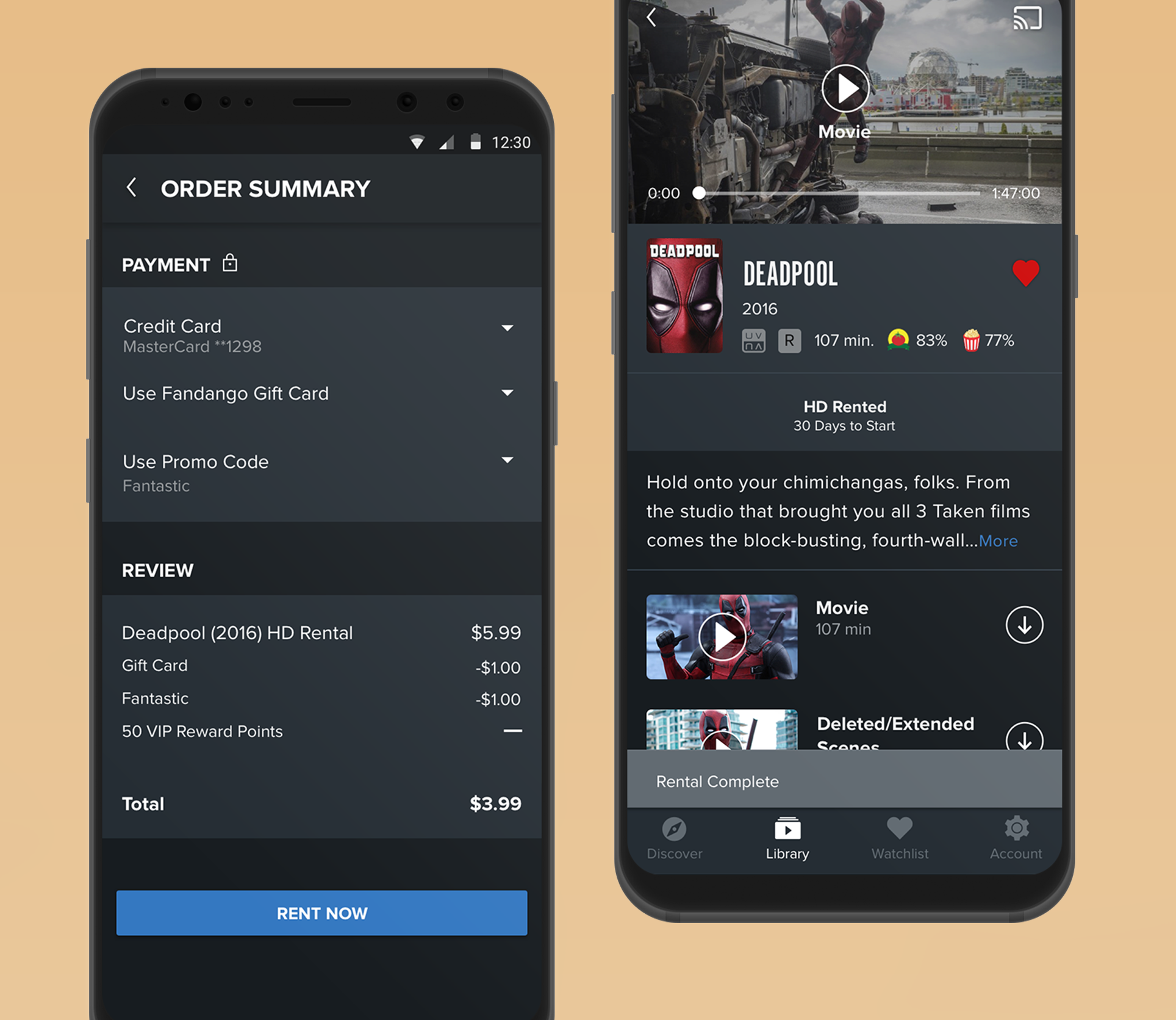
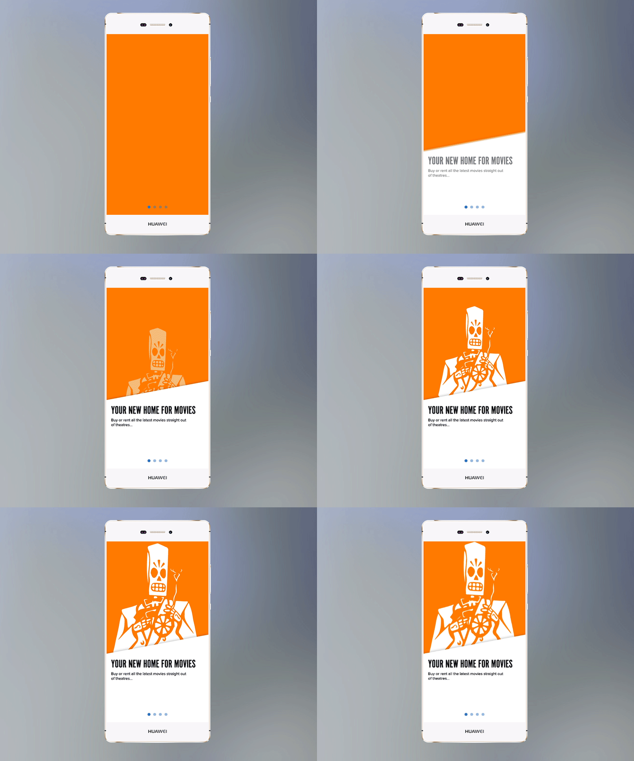
After our team came up with a cohesive redesigned set of atomic design system components, I used our new color system and typography to reskin the entire Android app, while establishing standardized Material design patterns.
- Cards to indicate tactility
- Feedback on tapped elements
- Primary and secondary colors between screen elements
RESULTS & IMPACT
After working with researchers who conducted multiple rounds of user tests, we released the redesigned version of the app in April of 2018. It was a huge accomplishment for the team and I'm glad that users loved what we were doing. Here are a couple stats that I saw at the time of my departure:
- 3.6 out of 5 stars in Google Play store.
- 8,504 Reviews as of 2018
I ALSO WORKED ON A HOST OF OTHER PRODUCTS
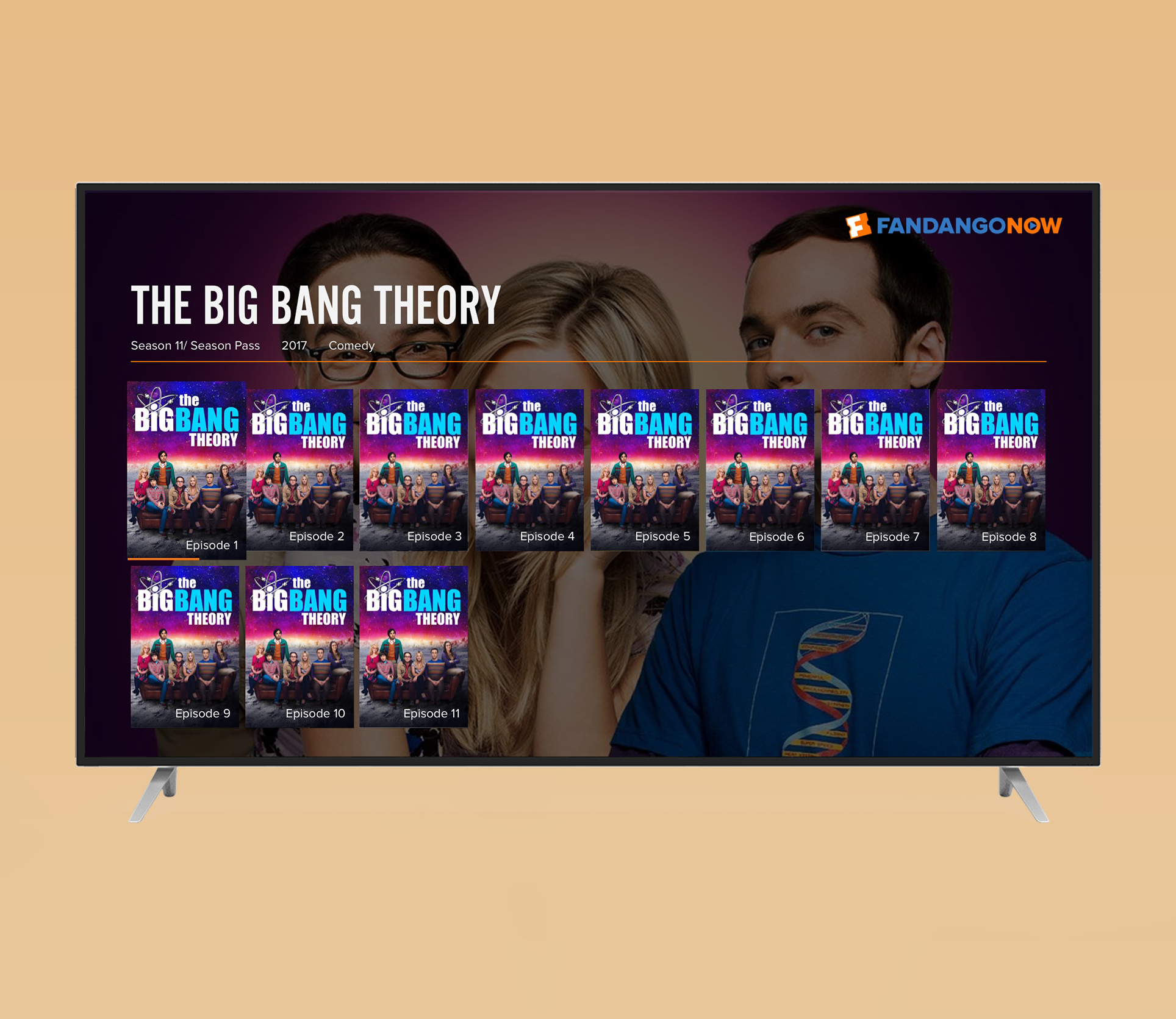
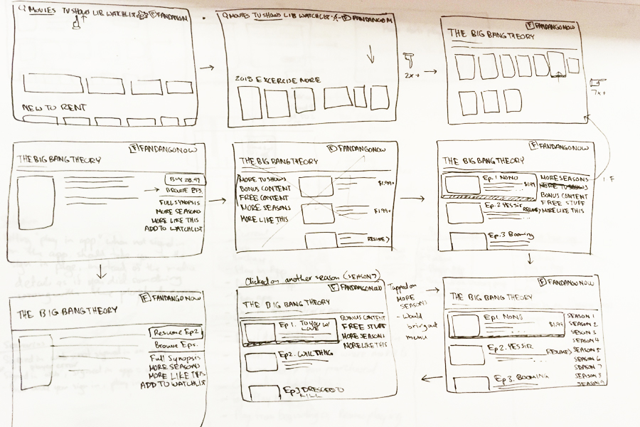
Context: In early 2018 our UX Research team conducted an in-house usability test for our FandangoNOW TV application. We were looking to find whether or not purchasing TV episodes was a smooth process. The test concluded that users were really confused once they drilled in to a season.
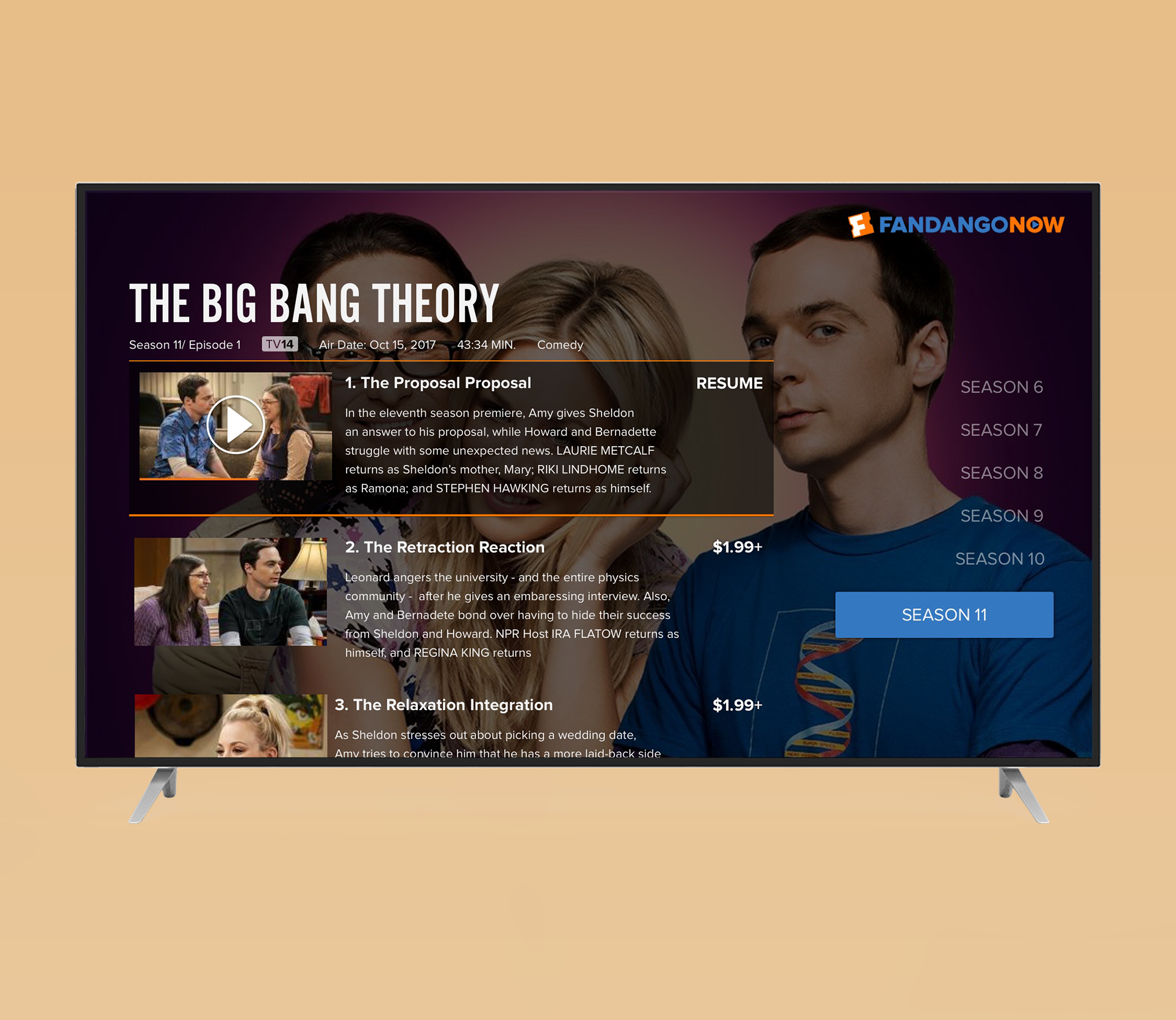
Problem: As the before mock on the left above illustrates, we showed episodes with the same identical TV posters and they had to click in to each poster in order to see a synopsis to find whether or not they were interested.
This project was back in 2018 so I vaguely remeber, but I think we also tried placing $1.99+ on each poster instead of the episode number, which confused people even more.
We found that test users actually wanted an streamlined way to see a synopsis, continue playback of purchased episodes and an easy way to navigate back and forth between seasons.
Movies Anywhere and FandangoNOW Webpage
