Empowering Impact: A Customizable Salesforce App for Effortless Donations and Volunteering
Philanthropy cloud
As a designer with a background in advancing education for inner-city youth in the non-profit space, working on the iOS mobile app for Salesforce Philanthropy Cloud was incredibly rewarding.
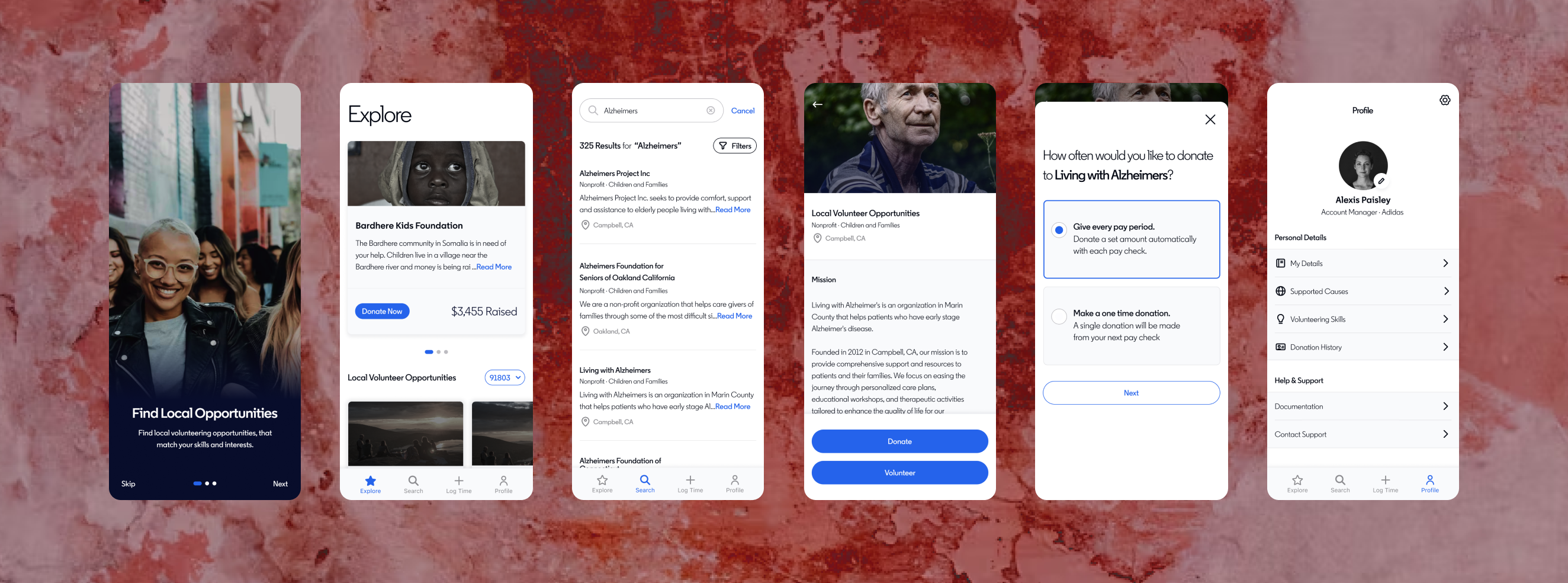
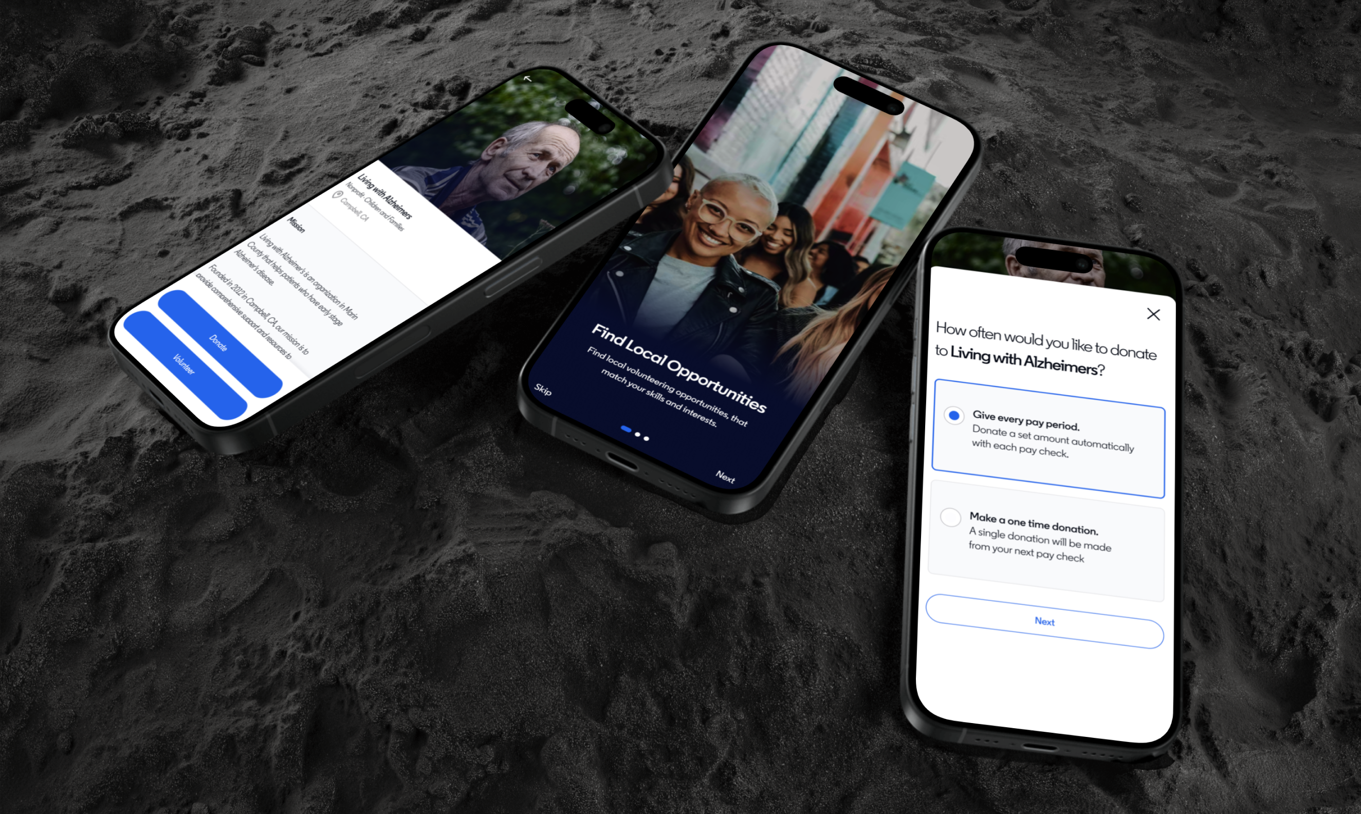
This digital white-label solution enabled our customers' employees to connect with their favorite local nonprofits through volunteer events and donation opportunities. The app allowed our customers to customize the experience based on their company branding.
Client companies included Adidas and Kellogs.
ROLE
Product Design
RESPONSIBILITIES
Lead iOS mobile designer
Workshop Facilitation
Strategy
Research
Project Management
Context
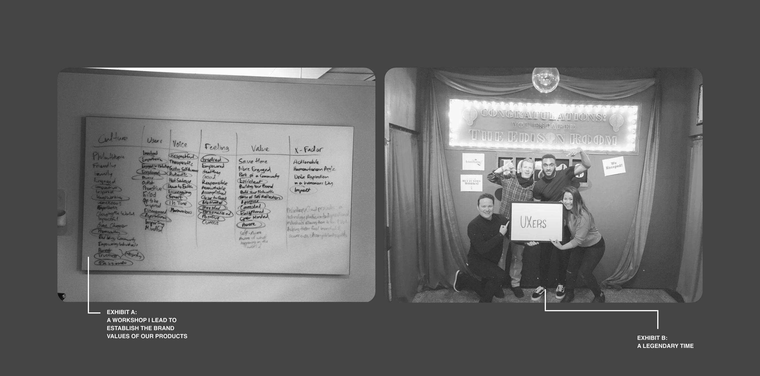
In the early stages, our team had divergent visions regarding the app's design, ranging from "fun" and "cute" to "serious" and "minimal." There was even the thought to move away from all of Salesforce's branding. To help the team align on a direction, we organized a 2-day workshop in San Francisco, diving into market challenges, target audience, tone, and value propositions.
A pivotal realization emerged: helping others also promotes self-awareness. This insight became the cornerstone of our product vision.
CHALLENGEs
We were challenged with the effort of building an iOS app from scratch to get an MVP live in the App Store within a tight 8-month deadline. We also needed to understand why people would—or wouldn’t—give their time or money to organizations. To figure this stuff out, my PM and I partnered with internal design teams at Apple, our lone Researcher, Jessica Munoz and a few of our customers.
concept development
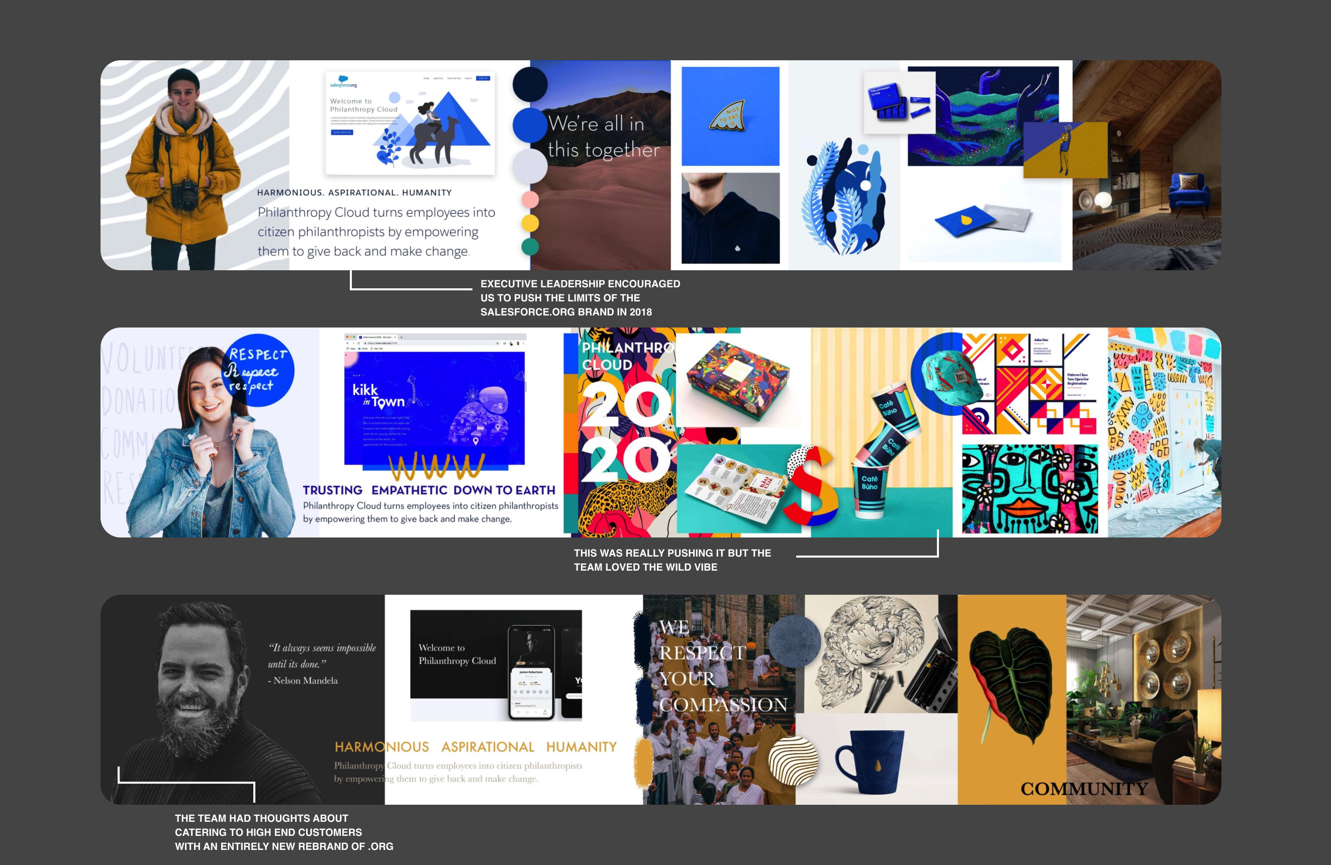
Faced with a mix of ideas about the app's design, I created three stylescapes: mild, spicy, and hot. The crowd favorite was 'mild', which integrated well with the Salesforce ecosystem and featured a sleek design with Makana blue tones.
But there was a twist: showing these options to our customers made us realize they weren't just looking for our own brand's stamp—they wanted to customiz themes to their own taste. That insight was a game-changer for our product's vision, leading us to create white-label app for flexible customization.
BACK TO BASICS AND IDENTIFYING GAPS
Our app mainly catered to two types of users: the internal admins at companies who would configure the app, and the employees who would use it daily.
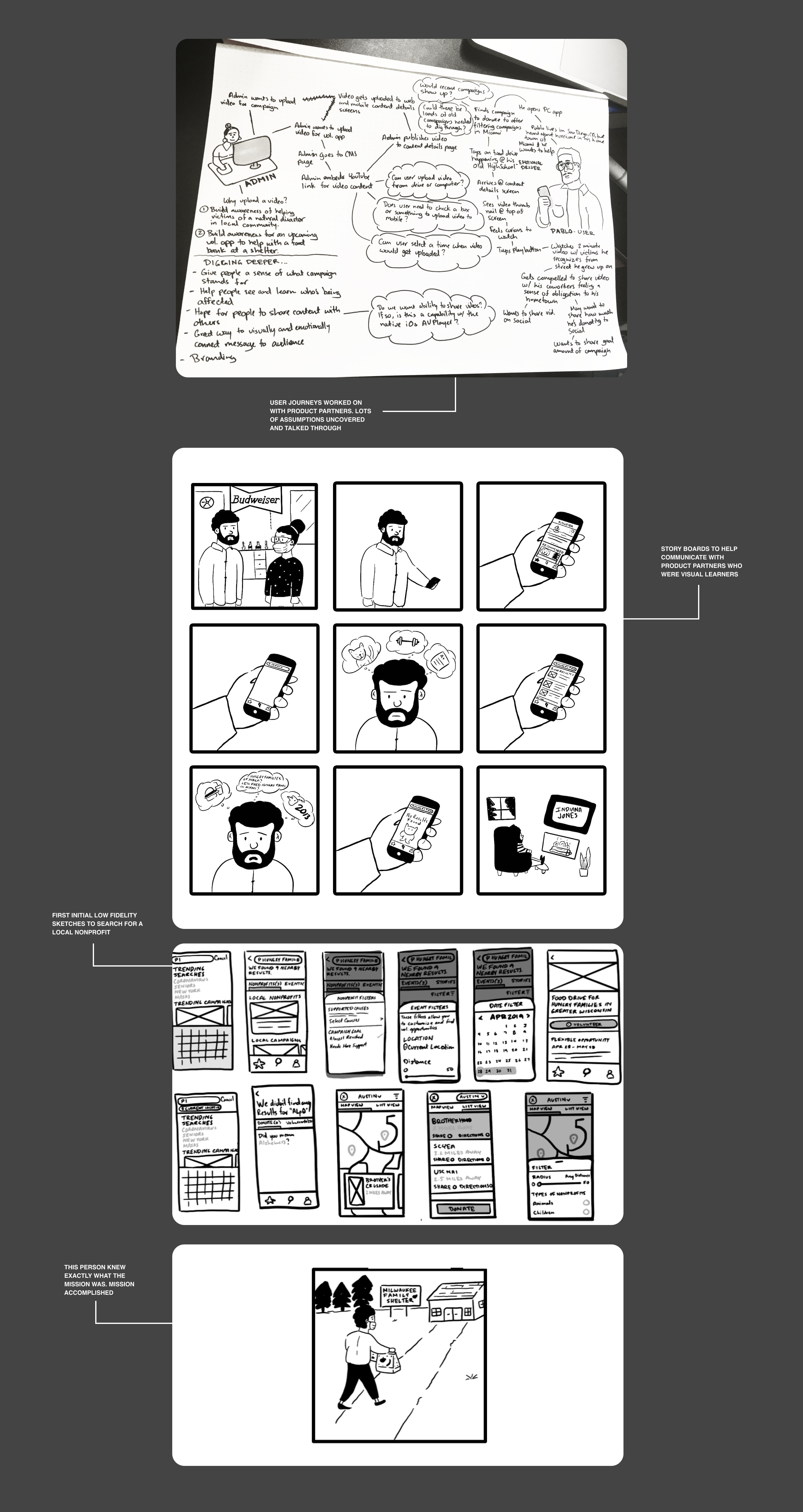
Throughout the design process, I kept engineers and product managers in the loop at every step. We had bi-weekly brainstorming sessions to walk through our personas’ journeys. Sometimes, we’d just sketch out ideas and bounce them around the room, really collaborating as a team to make sure we got it right.
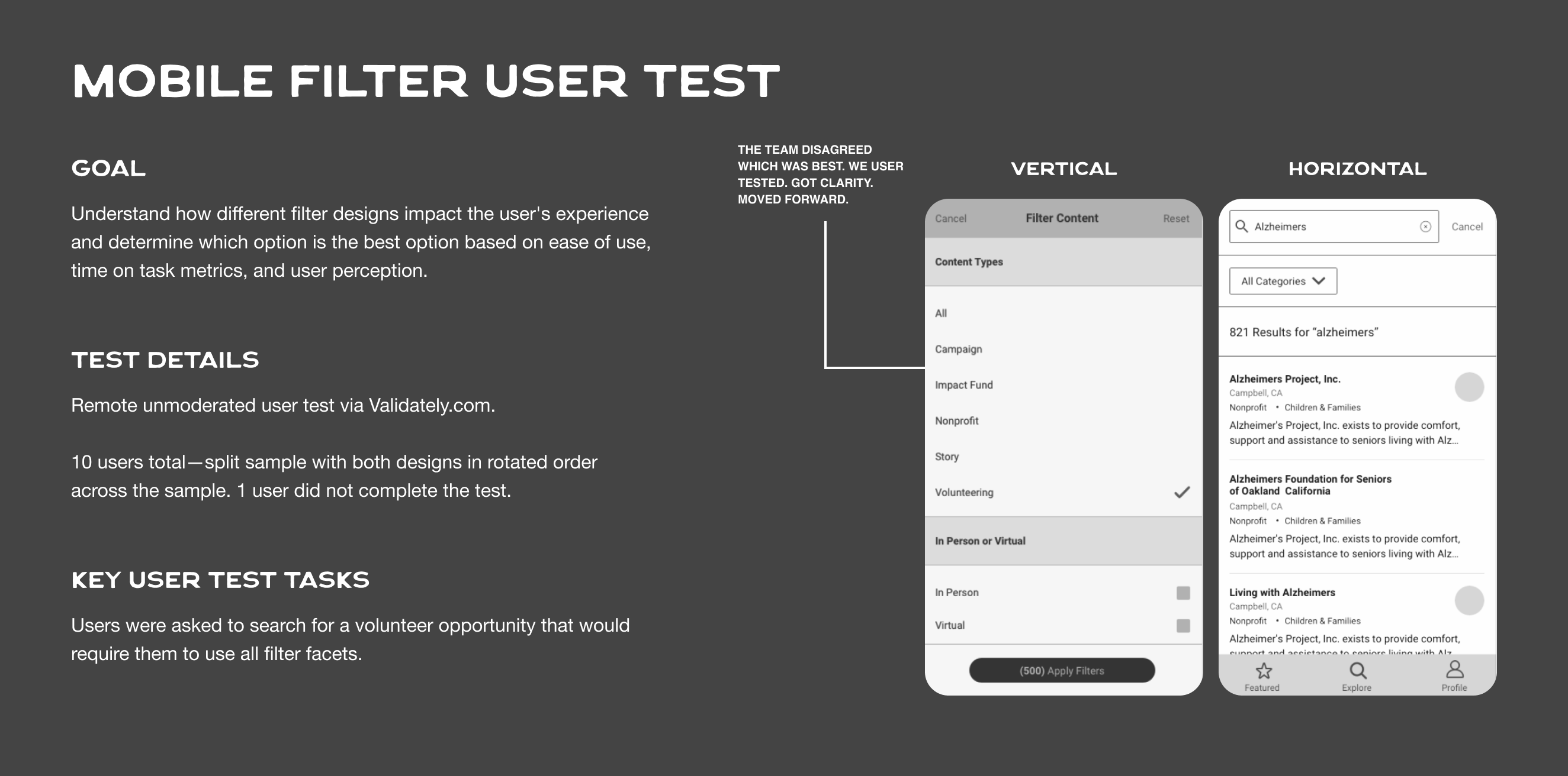
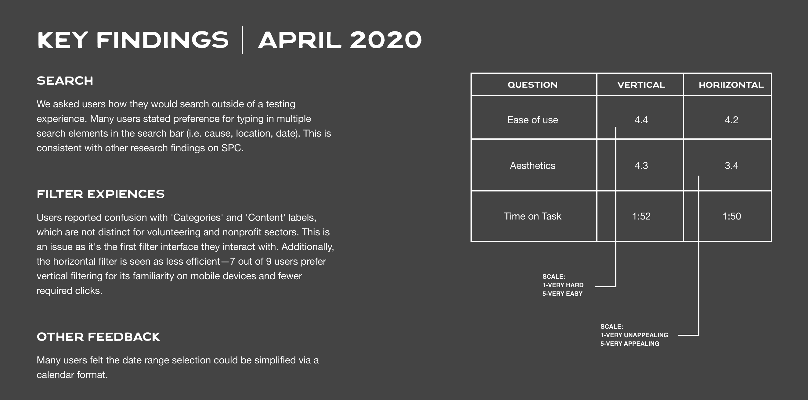
the luxury of user testing
Fortunately, we had a leadership team who encouraged us to user test, even with a tight timeline. We tested every experience of the flow from our explore page where folks could view company campaigns to volunteer and donation flows. These insights gave the team confidence we were moving in the right direction.
OUTCOME
In less than a year, we went from the concept of an idea to a live app, and working alongside Apple's team to get into the app store. We had our fair share of hurdles, like figuring out donation rules, and establishing workflows with an international team in South America.
But this wasn't just about utilizing UI design skills for me—it was a moment of consistent personal growth. I got to fine tune my skills around facilitation and deepened my understanding of human nature. This project taught me that embracing design is more so about embracing humanity first and focusing on pixels later.